Plotting
Decay chain diagrams
Use the Nuclide class plot() method to create a diagram of the
decay chain originating from a radionuclide:
>>> import radioactivedecay as rd
>>> nuc = rd.Nuclide('Mo-99')
>>> fig, ax = nuc.plot()
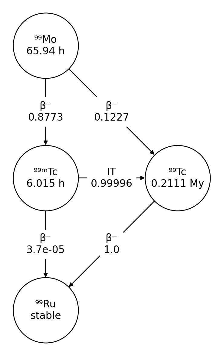
The decay chain diagrams are drawn using NetworkX and Matplotlib. The
plot() method returns the Matplotlib figure and axes objects containing
the decay chain diagram.
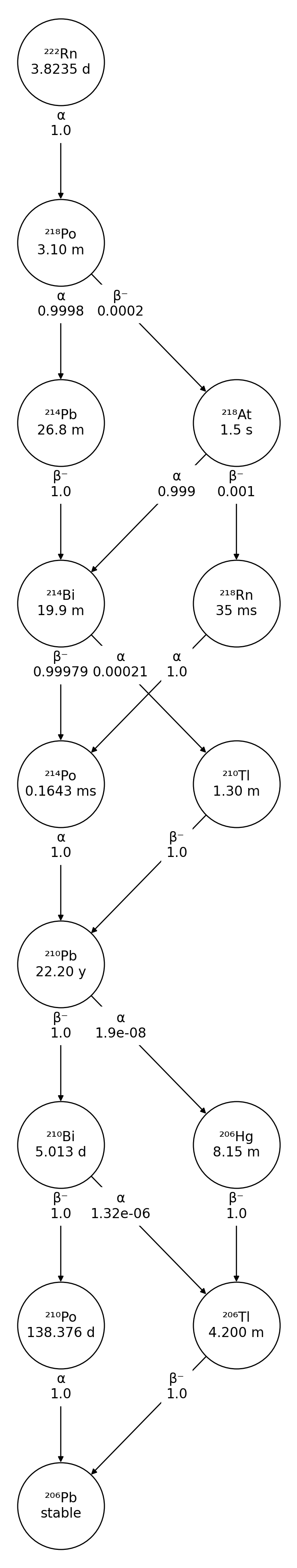
For more complicated decay chains, you can avoid decay mode and branching fraction labels overlapping by adjusting the label_pos parameter from the default value of 0.5:
>>> import radioactivedecay as rd
>>> nuc = rd.Nuclide('Rn-222')
>>> fig, ax = nuc.plot(label_pos=0.66)
Inventory decay graphs
The Inventory and InventoryHP class plot() method is for creating
graphs of the radioactive decay of the nuclides in an inventory and their
progeny over time. At its simplest, supply the decay timespan to the method:
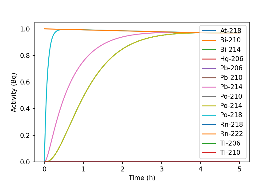
>>> inv = rd.Inventory({'Rn-222': 10.0})
>>> fig, ax = inv.plot(5, 'h')
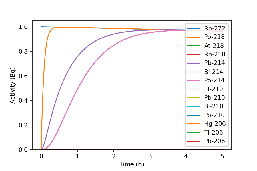
The graph shows the ingrowth of short-lived Rn-222 progeny. Use parameters such
as xscale, yscale, xmin, ymin and yunits to tailor the
graph to your own needs:
>>> fig, ax = inv.plot(1000, 'd', xscale='log', yscale='log', xmin=1, ymin=1E-17, yunits='mg')
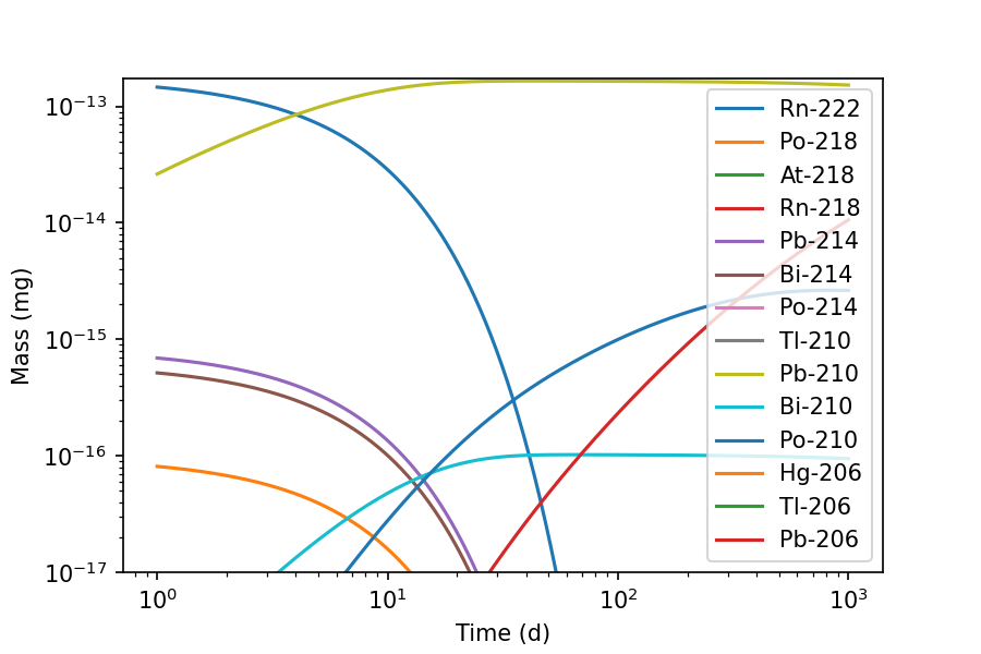
Now we can see the long-lived Pb-210 radionuclide and its progeny, which form
over a period of months. Large numbers of curves can make the graphs difficult
to read. Use the display parameter to specify only the nuclides you wish to
display. The curves follow the same order as the list you supply:
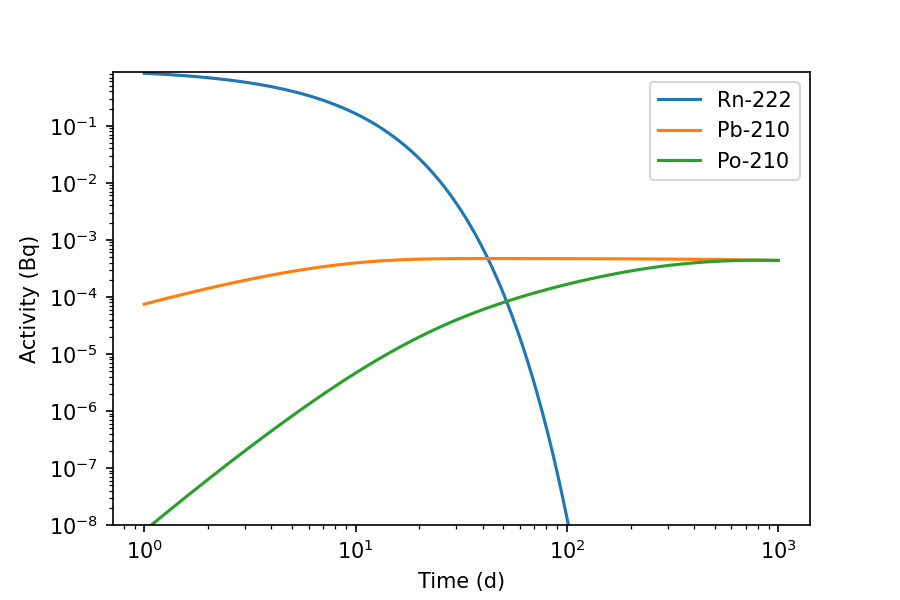
>>> fig, ax = inv.plot(1000, 'd', display=['Rn-222', 'Pb-210', 'Po-210'], xscale='log', yscale='log', xmin=1, ymin=1E-8)
By default nuclides are plotted according to those highest in the decay chains
downwards. If you wish to display nuclides in alphabetical order, use the
order parameter:
>>> fig, ax = inv.plot(5, 'h', order='alphabetical')
The plot() method returns the Matplotlib figure and axes objects containing
the graph. These can be used to save the figure to the file or to replot it
with your own Matplotlib parameters, e.g. to save a PNG image:
>>> fig.savefig('Rn-222.png', dpi=150)
For more information on handling the figure and axes objects, see the Matplotlib documentation.
To control which progeny are plotted, the decay_time_series_pandas() method can
be use to extract the data into a pandas dataframe which can be filtered as required
then plotted directly. As the plot method of a dataframe is a wrapper around Matplotlib,
the returned axes object can be used and manipulated in the usual way (see the
Matplotlib documentation).
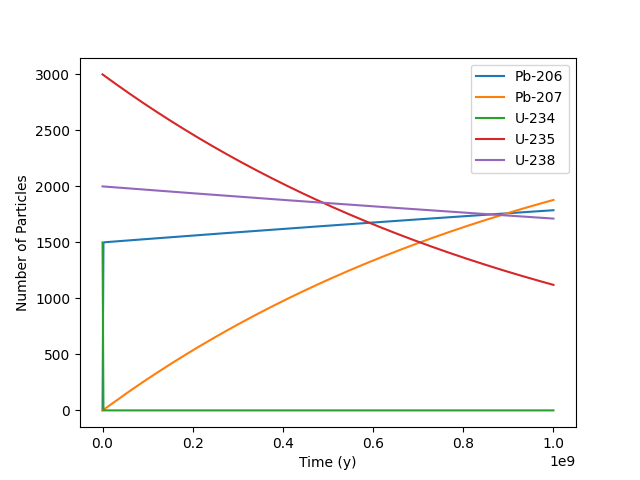
>>> inv = rd.Inventory({'U-238': 2000.0, 'U-235': 3000.0, 'U-234': 1500.0}, 'num')
>>> df = inv.decay_time_series_pandas(time_period=1E9, time_units='y', decay_units='num')
>>> df.plot(ylabel='Number of Particles')
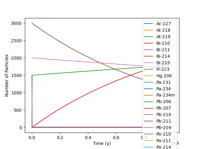
We can remove the progency we are not interested in and replot.
>>> filtered_df = df.loc[:, df.max() > 100]
>>> filtered_df.plot(ylabel='Number of Particles')
# This could have been done in a single statement, but has been split for demonstration purposes
# df.loc[:, df.max() > 100].plot(ylabel='Number of Particles')